A few years ago, many people complained that mobile sites and mobile apps are too limited. They couldn't include all the features from their desktop counterparts and some thought that was a bad thing.
Fast forward today and you'll notice that Google's desktop sites look more and more like Google's mobile apps. Most Google redesigns are all about taking mobile interfaces and adding them to the desktop. That's one of the reasons why many Google services drop advanced features and opt for simplified interfaces. This way, everything looks consistent and users can quickly switch from the mobile apps to the desktop apps.
2. The app launcher from the Google navigation bar was first available in the Google Search app for iOS.
3. Google Play's desktop interface had a lot of advanced features that were removed when Google updated the site to make it look more like the Android app.
4. The Google+ photo editor and Chrome Office editor are based on mobile apps that were ported to Native Client. You're now using the desktop to run mobile apps (only in Chrome).
5. Google Keep for Android has a lot more features than Google Keep for desktop. For example, you can't reorder notes or add more than one image in Google Keep for desktop.
Somehow, the most innovative and most interesting apps are now in the mobile space. That's where the users are moving and where things are constantly changing. Mobile is a flourishing testbed for new ideas.
Google updated the Gmail app for iOS and added a new interface for iPad. The sidebar that lets you go to a label or a different mail account is now persistent in the landscape mode and it's a lot smaller. It only shows your inbox tabs and the number of unread messages from each tab, but you can tap the arrow icon to find your labels. Unfortunately, you can't select some labels that are always displayed, like you can do in the desktop Gmail.
The sidebar that displays the messages from the current view is now hidden in the portrait mode, so you can better read your mail. You need to tap the three dot icon to see the list of messages, but you can also swipe from the left edge. The built-in mail client from iOS also hides the messages list in portrait mode.
There's also a full-screen compose box, so you get more room to write your messages.
Google mentions some other improvements: a better scrolling experience and some iOS7 features like the new keyboard.
The new Gmail for iPad has a lot in common with the updated Google Drive app for iPad. Google spends a lot of resources to make its UIs more consistent, so I wouldn't be surprised to see these interfaces added to the desktop.
Google experiments with a slightly different mobile search interface that has a different background color to emphasize the cards. "In this experiment, they've made the background darker in colour to add more contrast and make the cards stand out more," says Lee Jarratt, who noticed the new interface.
Google's image search engine has a new interface for smartphones and tablets. The new UI looks just like the desktop UI, but you can use swipes to navigate between the image results.
Here are some screenshots from my Nexus 7. When you tap an image result, a black box with a bigger version of the image will open. You can also find some additional information about the image.
Swipe left to see the next image result, swipe right to go to the previous result. Gestures work just like the left/right keyboard shortcuts in the desktop interface. Tap an image to open the page that includes it.
A similar interface is available for smartphones. Here's a screenshot from an iPhone running iOS7:
Google will probably say that it changed the interface to make it more consistent and provide an unified interface for both desktop and mobile devices. There are some other advantages: you can scroll down to see more results, you can scroll up and quickly change the query or switch to web search.
I find the old interface more intuitive and better suited for mobile devices. It made it more obvious that you can use gestures by showing the previous and the next image result, search results didn't move around and you could find more information about the images. The new smartphone interface only displays the domain name and it no longer shows the title of the page and the image size (the tablet interface still shows them). Here's a screenshot of the old UI:
Google has a great mobile interface for image search. It was launched in 2010 and improved multiple times since then. You can use swipes to go to the next image result or to the previous one. It looks like Google changed the image search UI for smartphones and tablets and now sends you to a landing page that shows the image and loads the corresponding page in the background. Intuitive gestures are gone and now you have to use the back button.
This seems to be limited to iPhones and iPads running iOS 7, so it's probably a bug. A lot of people complain about this in the Google Search Forum.
There are many reasons why the new interface is strange: loading the associated page uses more bandwidth and that's not a good idea for mobile devices, it's more difficult to check multiple search results, thumbnails are smaller and even the desktop interface shows a bigger image instead of sending users to a new page.
As previously anticipated, Google's mobile site has a new layout that uses cards, just like Google Now, Google Maps, Google+ and an increasingly long list of Google services and apps.
"A new look and feel for Google Search and ads on your phones and tablets. It's cleaner and simpler, optimized for touch, with results clustered on cards so you can focus on the answers you're looking for," informs Google's search blog.
Ads stand out a lot more and, depending on your phone's resolution and screen size, you might not even see a regular search result without scrolling down. Google shows up to 2 ads at the top of the page and no longer uses a different background color. There's just a small "Ad" label next to the URL.
Sections are clearly separated and there's more white space, so the information density is lower.
Pagination has been simplified and you can only go to the previous or the next page of results and to the first results page.
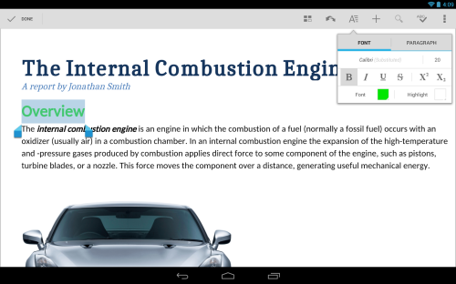
Google announced a new Quickoffice app for Android and iOS that's free and it's optimized for both phones and tablets. The previous paid Quickoffice apps are no longer available, but not all the features from the paid apps are included in the free app. The new Quickoffice application supports a single cloud storage provider (Google Drive) and it requires to log in using a Google account.
Google acquired Quickoffice because it did a better job at handling Microsoft Office files than Google Docs. This was especially important for Google Apps users. Google started to work on porting Quickoffice to Native Client and integrating the application with Chrome OS. Now the mobile apps are free.
There's some overlap between Quickoffice and Google Drive apps, so offering two apps for editing documents, spreadsheets and presentations may seem strange. Quickoffice is a basic office suite that works offline, it lets you create and edit Microsoft Office files and annotate PDFs. You can store these files in Google Drive or on your mobile device. Files uploaded by Quickoffice can't be edited by Google Drive apps without converting them. Google Drive doesn't let you create or edit files when you are offline.
I find the Drive editing interface more intuitive and easier to use, but Quickoffice offers more features. When you open a file in Google Drive for iOS, the application first needs to upload the file to Google Drive. If you try the same thing in Quickoffice, the application opens the file and lets you edit it. I hope that the two apps will merge at some point.
Even if you don't need Quickoffice, it's still a good idea to install the app: you'll get 10GB of free Drive storage for 2 years. "If you sign in to your Google Account from the new Quickoffice app for Android or iOS by September 26, 2013, for two years, an extra 10GB of Google Drive storage will be added to your account in the next few weeks." If you don't get the extra storage, remember that will be added "in the next few weeks".
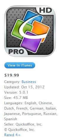
Those who paid for Quickoffice will probably be disappointed: no more updates for their apps, no iOS7 bug fixes. "Quickoffice Pro and Pro HD are not fully compatible with iOS 7 and some features may not work. After March 31, 2014, all cloud storage services will become unavailable on Quickoffice Pro and Quickoffice Pro HD," informs Google. Fortunately, "if you purchased Quickoffice Pro or Pro HD on or after June 17, 2013, you are eligible to receive 50GB of free Google Drive storage (with proof of purchase)."
(Quickoffice Pro and Quickoffice Pro HD used to cost $14.99 and $19.99. Pretty expensive, indeed.)
When Google released a new version of the Wallet app for Android, it was clear that the features that were available to every Android device in the US didn't require NFC or carriers' approval. The new features are now available for iPhone users.
"The response from users has been great, and we want iOS users to enjoy all of the benefits too. So, today we're introducing the first Google Wallet app for iPhone (iOS v6.0+), which means even more people can easily send money to friends and store all of their loyalty cards and offers in one place," informs Google.
I assume that Google will try to move beyond NFC and find other ways to make Google Wallet useful and widely available. It's not enough to have a good product if most of the people can't use it. Somewhere between security issues, NFC's adoption, carriers' competing services, Google Wallet couldn't find a way to flourish.
Another thing that suggests that Google will move beyond NFC is the Bump acquisition. "Our mission at Bump has always been to build the simplest tools for sharing the information you care about with other people and devices," informed Bump's blog. Bump lets you share photos, videos, contacts without using NFC and it works on Android and iOS. Bump uses your Internet connection to share data with the people nearby.
The YouTube Creator blog announced that YouTube's mobile apps will add a feature that lets you download videos so you can watch them offline.
"Later this year we'll launch a new feature on YouTube's mobile apps that will help you reach fans -- even when they're not connected to the Internet. This upcoming feature will allow people to add videos to their device to watch for a short period when an Internet connection is unavailable."
AllThingsD reports that this feature will be available next month and that the downloaded videos will be available for 48 hours. "Next month, Google's video site will let viewers save clips on their phones and other mobile devices for up to 48 hours, so they can watch them when they're not online. The videos will still be free, and Google will run ads on the clips, which will be available via its mobile apps."
YouTube's Android app already has a preloading feature for subscriptions and the "watch later" playlist, but this feature has a catch: you need to be online when starting to play a video. This makes the feature less useful.
A few years ago, YouTube experimented with downloads for some partner channels. Now it only lets you download your videos. There are a lot of third-party applications and extensions for downloading YouTube videos, but you won't find them in the Play Store or the Chrome Web Store because they break YouTube's terms of use.
There's no Chrome Beta for iOS, so you can't enable the data compression proxy. This feature is gradually rolled out and some lucky Chrome users were invited to try it: "You're invited. Join a limited preview of a new feature from Chrome. Save bandwidth and browse more securely."
Here's a video that shows this feature:
If you use Android, you can install Chrome Beta and enable this feature in the settings or use the regular Chrome version and wait until you get an invite.
There are still a lot of people who use feature phones and Google decided to improve the Gmail interface for these phones. The new version is closer to the smartphone UI, but it doesn't use AJAX, so you have to load a new page every time you perform an action.
"You'll get a number of improvements that reduce the number of button presses required to read, reply and compose emails. For example, you can reply directly to a message from the thread view, you can choose to move to the previous or next conversation, and much more," explains Google.
Gmail used to have a Java app for feature phones, but this is no longer available, at least not officially. Probably the best option to read your messages on a feature phone is to install Opera Mini and use the mobile Gmail site. Speaking of Opera Mini, you'll get the same "feature phone" Gmail interface even if you use an iPhone or an Android phone.
Remember the card-style redesign for Google mobile search? Google tests a similar interface for tablets:
There's more white space, top search results stand out even more, while Knowledge Graph cards and results from specialized Google search engines look like distinct sections of the page.
Google's mobile sign-in page has a new interface that uses the same slogan from the desktop: "One password. All of Google." It's a more crowded page that includes a silhouette icon, a list of icons for Google services like Gmail, YouTube, Google Maps and a small "Create an account" link at the bottom of the page instead of the red "sign up" button.
Here's the old interface:
For some reason, the new sign-in page lacks the "stay signed in" checkbox.
The latest version of the Gmail app for iOS added a better way to open photo attachments. Until now, you had to tap each photo to open it using the app's internal browser and go back to the message.
Now you can tap a photo attachment and use swipes to go to the next or previous image, just like in the built-in Photos app.
The "print" link is no longer displayed next to the thumbnail, but it's still available in the actions menu. For some reason, filenames are no longer included.
Another new feature: "when selecting a Google Drive file or Google+ link you'll now go directly to the app if it's installed. This can be turned off using the in-app settings."
Google tests a new card-style interface for mobile search results. There are special cards for Knowledge Graph results, results from specialized search engines and for related searches. The new interface only shows Previous/Next buttons.
Many Google web apps and mobile apps use the card-style interface that was first added to Google Now. You can find it in Google Search, Google Play, Google+, the newGoogle Maps, Google Keep, the new YouTube app. "A lot of use of white space, not a lot of artificial, surface-like divisions. We're really counting on bold typography, white space, and big images to give emphasis, give character and give hierarchy to the cards that we give you," said Matias Duarte, who leads the Android User Experience team.
One of the most annoying things when you install a new Google app in iOS is that you have to sign in. If you install Gmail, Google+, YouTube, Chrome and Google Maps, you'll have to enter your email address and password 5 times. Android's account manager solves this issue.
Somehow Google managed to bring shared accounts to iOS, although it's not exactly clear how. The latest version of the YouTube app and the new AdSense app bring the following features:
- support for multiple Google accounts - quickly switching between accounts without entering your password - the accounts are shared between Google apps.
If you enter the credentials of a Google account in the YouTube app and then open the AdSense app, you'll find the new account and you can sign in without entering the password. If you remove an account, it will be removed from the other Google apps that support this feature. I assume that most Google apps for iOS will be updated to use this brilliant feature.
YouTube's help center informs that "if you've signed in with another Google app on your iOS device, you may see this account listed." This means that the accounts are associated with your device, so maybe Google uses an unique ID for each device. iOS devices have unique IDs called UDIDs, but they can no longer be used in iOS 7. App developers can use vendor IDs, which are identical for the apps from the same developer and they "uniquely identify a device to the app's vendor". It's interesting to see that "the value changes when the user deletes all of that vendor's apps from the device and subsequently reinstalls one or more of them."
Gmail's mobile site has a cool feature that adds video titles to all the YouTube links from a message. They're still links, but you know more about the videos before clicking them.
Here's an example from Gmail's mobile web app in Chrome for Android:
This also works in Gmail's iOS app and Gmail's mobile web app in other Android/iOS browsers. The message from this screenshot only included a link to a YouTube video, with no special anchor text.
After so much hype, many people were disappointed to see Motorola's first phone influenced by Google. Motorola was acquired by Google two years ago for $12.5 billion, but the real reason why Google bought Motorola wasn't clear. Motorola's patents weren't that useful, Motorola's market share is declining and the company continues to lose money every quarter.
Moto X is supposed to be Motorola's "hero" device, the flagship that shows the new direction of the company. More than 70 Google employees work at Motorola: from Motorola's new CEO, Dennis Woodside, to Steve Horowitz, Motorola's head of software and one of the original members of the Android team. "Nobody's buying products because of minor incremental improvements to Android. So let's rely on what the Android team does and build experiences that will leverage Google services," says Steve Horowitz.
Motorola's phones now use tweaked version of the stock Android. There are some changes, some new apps and some new versions of the stock apps, but they're added on top of the stock Android, so you'll see faster updates. Motorola not only uses Google's Android software, but it tries to create hardware that makes it easy to use Google's software and enhances its features.
Moto X is assembled in the US, in a former Nokia factory. "Motorola placed its entire assembly operation for the X in Fort Worth, Texas. Components come from 16 states and countries around the world, but 2,000 or so workers assemble the phones in Texas and ship them all over America," informs The Verge. Phones are personalized using an online service called Moto Maker, which lets you select the color of the backplate, the front and of the volume buttons, add a signature, pick some matching headphones and make the phone your own. In the future, you'll also be able to pick a different material: wood instead of plastic. At launch, Moto Maker will be limited to AT&T. Motorola will open it to the other US carriers in the near future: Verizon, Sprint, T-Mobile and US Cellular.
"When a car company allows you to choose your interior details or Nike allows you to design your own shoes, it creates what Moto X head product manager Lior Ron calls 'the Ikea effect.' 'Once you finish assembling it, you're emotionally attached to that furniture,' Ron says. 'It's now yours. We see the same attachment here. You've basically gone through the process to build your phone - you are now emotionally attached to that phone.'"
The phone uses two low-power processors that are used by Moto X's most important features. Moto X is always listening, so you can say "ok google now" and then ask something. It's called touchless control and it always you to use your phone without having to touch it. The hotword feature is available in the Google Search app, but Moto X's hardware makes it more useful because you don't have to interact with the device first. There's also a gesture that quickly launches the camera app: just shake your wrist.
Moto X always shows the time and some notification icons. This feature works well because the phone has an AMOLED screen and black pixels are unlit, saving power.
So why are people disappointed? The phone doesn't have great specs: a 4.7-inch 720p AMOLED display, a dual-core Snapdragon S4 Pro 1.7GHz CPU, 2GB of RAM, 2200 mAh battery, 10 MP camera. So last year, you might say. A mid-range phone that costs the same as Samsung's Galaxy S4 or HTC One ($200 on contract for the 16GB version)? Non-removable battery and no SD card?
"We could go and make a higher-resolution screen, but it would just suck battery and nobody would know the difference," says Motorola's Jim Wicks. Most likely, Motorola couldn't source from Samsung a 1080p AMOLED screen and the 720p display was good enough. The dual-core CPU is cheaper, improves battery life and has a similar performance to the quad-core S4 Pro. It uses the same GPU from Nexus 4 and the new Nexus 7 and that's great. A phone is not about raw power, it's about responsiveness, battery life, ease of use. Most of the time, that raw power is left unused. Phones are more about GPU than CPU because responsiveness is more important than performance.
Moto X is not about specs, it's about experience and that's a lesson from the Apple school of thought. Specs are great, but only if they're actually used to build a great experience. A 400+ PPI 1080p screen and a quad-core CPU have their drawbacks and they're probably overkill. Apple's products don't use them, but they work well and are often more responsive than Android devices. The secret is probably software optimization and the integration between hardware and software.
"We've done additional optimizations on top of that such as optimizing the entire Linux user space to move it to an ARM instruction set, cache optimization, Dalvik just-in-time optimization, and we've changed the file system. It's full hardware-software integration to deliver best-in-class performance," says Iqbal Arshad, Motorola's senior vice president of engineering.
It's more about a high-end experience than high-end specs and that's hard to measure. People read the specs and assume that the phone with the fastest processor is the best one, but that's not always true. It's also about tricks that make the device appear more responsive than it really is, tricks that conserve battery, animations that make the experience more pleasant, squeezing every bit of performance from the hardware.
Moto X tries win the specs wars by ignoring it and focusing on something else: the human factor. Patriotism, esthetics, customization, efficiency - all of these try to make the phone more appealing and less intimidating. It's a new Motorola and they're just getting started.
"The Moto X will go on sale in the United States at the end of August or the beginning of September for a suggested retail price of $199.99 to customers who sign a two-year contract at five of the biggest U.S. mobile network operators," informs Reuters.
Almost one year after Google Maps was removed from iOS and 7 months after Google released a Maps app for iPhone, you can finally install the Google Maps app on an iPad and actually use it. Installing the iPhone app on an iPad wasn't a good idea, so the web app was a good alternative.
The updated Google Maps app for iPhone and iPad looks just like the Android app and has almost the same features: incident reporting, dynamic rerouting, integration with Zagat and Google Offers, Google+ recommendations, the "explore" feature that lets you find great places without searching for them, biking directions and navigation, offline maps (type OK maps in the search box).
To open the "explore" section, tap the search box and select "explore". Then you can tap "eat", "drink", "shop", "play" or "sleep" and find a lot of useful suggestions. Many of them are influenced by the reviews of the people from your Google+ circles.
The full-screen map provides an immersive experience.
There's support for incident reports, although it's not clear if the new feature has anything to do with the Waze acquisition.
Google Maps still supports layers, but not all the layers from the old Android app. There are layers for traffic, public transit, bicycling and satellite maps.
When you first launch the app, Google Maps shows the following screen. The option to improve Google Maps by sharing anonymous location data is enabled by default. This means that Google no longer has to rely on Android devices to get traffic data. A similar option was displayed last year, when Google Maps for iOS was launched, so it's not new.
A year ago, things were very different: Google Maps for Android was a lot more powerful than the built-in Maps app for iOS powered by Google Maps data. Now Google Maps apps for Android and iOS have almost the same features. Can you find some features that are only available in the Android app?
While the mobile web app uses the new map styles, it still has the old interface, but that will probably change soon. There's also a strange "null" message below the map, which shows that there are still some bugs that need to be fixed.
If you've upgraded to Google Maps 7 for Android and you miss the My Maps feature, you can still find it in the mobile web app: click the arrow icon next to the search box, select "My Places" and then click "Maps".